Showing posts with label Monochrome. Show all posts

Thursday, 23 July 2015

Ideas around an exhibition from 1975

A few postings back I had a look at the changing styles of Spanish architecture in one of their cemeteries in Menorca. It is astonishing how they seem to have abandoned their ability to create beautiful structures when confronted for the need of the new. There are practical reasons and those of cost that will be driving them towards this, especially at a time when behind Greece, Spain is close be being bankrupt. That aside I have spent some time looking at their commercial development. They are quite capable in providing infrastructure. They make good roads, they are wide, have pavements, street lighting and adequate parking. The money for infrastructure is of course from government sources, or more likely the EU when the billboards are studied that promote the works. The story after that is somewhat sad. The businesses who are asked to populate the commercial areas do not last and the empty spaces between buildings seemingly will never be filled. Those that are built are becoming empty allowing the scrubland to begin its slow but reclamation back to scrubland.

While looking at these and photographing the area I was thinking of New Topographics: Photographs of a Man-altered Landscape, 1975. The 270 sqaure miles of Menorca is a Unesco Biosphere reserve, a designation issued in 1993 for the rich flora and fauna that thrive in Minorca’s forests, gorges, wetlands, salt marshes and hillsides : a protected place. The loss of natural landscape here is so significant I begin to wonder what the process must be to dig it up, spoil it and make buildings and roads that nobody will use. Questions I did not have the time (or perhaps the language skills) to ask. What I have done is a series of images that could be part of a larger discourse. For now most of them they remain as raw files requiring PP but as I am excited about seeing some for myself I have looked at one and complete the work. It shows the ambitions of the developer with an older building extended although for all that it is empty. The pedestrian crossing, wide pavements and street lights for nothing. While there I saw few people and found the place almost as spooky as the cemetery. All images Leica MM, 28mm Elmarit.

People ?


Reclaiming the Land

Wednesday, 8 July 2015

The Spanish Cemetery


For some years I have tried to capture the architecture of the Spanish island of Menorca. Not known as a party island it is quiet and retains many of the influences of its former governments, including the Spanish, French and the English. What we have then is an eclectic mix of European styles from the 16-17th century with contemporary styles, especially in the non holiday housing.
A walk through the streets of Mahon (the capital) gives the feeling of an unregulated place with little or no consideration to the juxtaposition of the old and new. I find this rag tag disharmony an irritation and therefore difficult to photograph. This may be (almost certainly is) my inability to choose images that could tell the Menorcan story through the architecture. There are also the problems of styles from the place having been ruled by a number of countries and my Englishness in wanting a clear pattern. The Port of Mahon had a strategic importance for those fighting in the Mediterranean with the Spanish, French and English all having made it home for their fleets due to its secluded deep harbour. So the mixture, when it occurs is somehow messy and I struggle with the laid back approach of the culture and its "Manyana" (tommorow) feel that one day it will be sorted out, but not today. One particular feature of the Spanish culture that has interested me for 
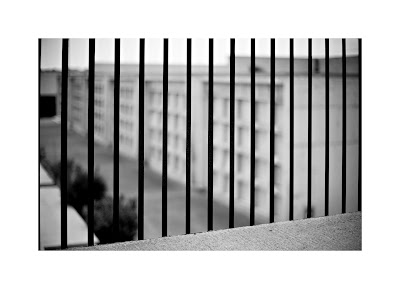
some years is their cemeteries. I have seen nothing like these in the UK and the burial method (above ground) has created architecture that is visually interesting and culturally different. The burial spaces (crypts) all being above ground is thought provoking and the eclectic display of portraits of the deceased make the experience of visiting a very moving experience. The feeling that you are walking amongst the dead is tangible, as apposed the UK graveyard 
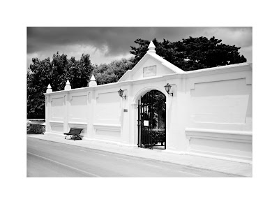
where you quite literally walk on the dead. The images below are from the town of Es Castell and on arrival the entrance into the walled area is bright and fresh. The level of maintenance is sublime with a clear message that this is not a sinister place. Probably due to the age and size of the original 
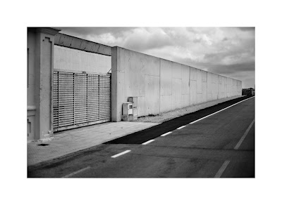
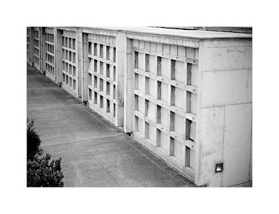
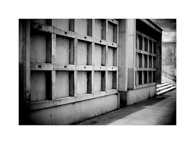
buildings there was a need to construct a new part by way of an extension. The new cemetery is frightful place, physically and emotionally. There is no architectural style whatsoever, or perhaps there is, it is a style of the nuclear age. The walls, the above ground crypts, the paving, the buildings are all constructed of reinforced concrete, with no attempt to soften the visual impact of this engineering material. I have spent 30 years working with reinforced concrete, building bridges, water treatment, sewage treatment, waste disposal, petrochemical and marine structures but none of that prepared me for the concrete cemetery. It has given the place a feeling of industrial utility with its engineering and lack of any human intervention in the design to take a step beyond its purpose to please the eye. All of the exposed steelwork including doors and handrails are not painted or coated. The steel is bare, it is rusting and it contrasts with the white concrete to make a 
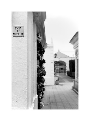
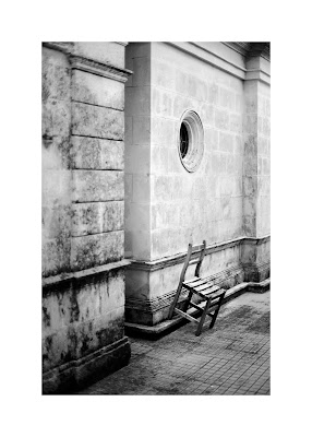
monochrome place that has a binary existence. The photography of the old part was a delight, the shapes, the names of the deceased, the flowers, the curves of the cornices and archways, the haphazardly placed chair, have a harmony with the needs, not of the dead perhaps but certainly the bereaved or the visitor. The birds sang and the trees whispered in a warm breeze and strangely I felt a warmth there, I was not intimidated by the faces looking at me and I did not feel as though I had trespassed. I had taken the precaution of asking a local Spanish friend if there were any restrictions in terms of etiquette or local bylaws about making photographs, and was told there were none, so I did not feel obliged to work quickly and then escape. When I walked towards the new part I felt a chill.  This place has no character, well thats not true, it has the character of a Stephen King film. Desolate, grey and waiting for death. The rows and rows of spaces waiting for their coffins is the equivalent of pre dug graves in a UK graveyard. A loud noise breaks the silence as I work my way around taking the photographs. I can see nobody and it is difficult to position the noise, an engine, maybe a grass cutter, but there is no grass. I then glimpse a man with a blower machine moving along the rows chasing leaves. Maybe I could have stayed longer, tried something else with the photography, a wide angle perhaps, but no, I left. I was not at ease and I have never experienced two similar places with so totally different atmosphere than the old and new cemetery. The architecture, the change from classic Spanish with its gentle curves and finials, its textures and warmth, its apparent empathy with the dead and then the cold stark construction with  reinforced concrete and the dark rusting steelwork. I did venture too far and at the back of the buildings found various empty coffins which I did not photograph. There is a limit to what I needed and this seemed a step too far.

Over dinner with some friends I outlined my shoot. Needless to say not everyone sees this type of behaviour as normal (the English) but my Spanish friends love the place and agree that it is a special. Photographers, sometimes misunderstood or a bit weird, who knows.

I had spent some time considering how I wanted the images to convey a place that is different. Different in as much as however you look at them cemeteries are a place where we go to for a limited number of reasons. It is mostly for reflection to visit a loved ones grave and remember them so there is a focus on a single grave. I didn't want the images to be as if from an undertaker or the local authority. My photographs needed to show the atmosphere and the architecture without being overtly clinical. I choose to use a standard lens  (50mm on FF sensor) so that my vision (and therefore my perception) was not distorted. My selection to shoot with a wide aperture was made so that limited detail is shown, except where I specifically desired it.  

The outcome as far as a learning experience was significant. The emotions I felt at the time were extreme and this affected the photography without doubt. I should perhaps have made a second visit, hoping that the "place" had less to say directly to me and then I could have explored it more thoroughly photographically, but my instinct is that any fear I had is somewhere in the original photographs and a second visit would be too contrived. I could have done better but I was not prepared for the emotional impact and that is something I will need to overcome if I find myself in a similar situation in the future.

The photographs shown below are the start of what one day could be a larger body of work, which requires more travel to Spain !!.

Old Cemetery 5

Old Cemetery 1
Old Cemetery 2
Old Cemetery 3
Old Cemetery 4
New Cemetery 1
New Cemetery 2
New Cemetery 3
New Cemetery 4


Old Cemetery 6


Monday, 12 January 2015

Probing some new Ideas.

The three images below are the start of a new idea using shallow depth of field to connote the short sightedness of society, especially in the rural environment and economy. It is difficult to know where this is likely to end, it may have ended already.

The remains of a hedge.


National speed limit - really !.


Once a forest.


Tuesday, 23 December 2014

Cumbria - November 2014

A five night stay in Cumbria during November was a pleasant break from the normal routine and while no photography was planned there was the inevitable bag of cameras making the trip.
It is easy to fall into the Lake District trap and get carried away with the magnificence of the place (remember I live in Norfolk) but that is now behind me and while I am happy to watch light chase across the fells I don't feel the need to try and capture the grand vista with a 5x4 as I did in the past, but did find time for one at dusk. When walking I tend to look for some detail or think of Fay Godwin and her fascination with the enclosure and access. However the following images are not forming part of the module but I include them purely as a note. All here are with the Leica MM and 35mm or 75mm lens.


Sunday, 31 August 2014

The Lathe

Whats all this about ?
Although I trained and work(ed) in Civil Engineering I also trained myself, through night school at the local Technical College to use a lathe and other machine tools. I spent four years making a 5" gauge live steam locomotive amongst many other projects and have a well equipped workshop, that doesn't get much use these days apart from making parts for the ageing lawnmower.
For a short while the other day The Lathe became an artefact, a found object but only when I had a need for it to be. At all other times it is just there, it gets oiled and run to keep it in good condition then covered over. Suddenly when studied through the viewfinder it was different. I saw more detail, the swarf from the last job (what was I making ?) and the worn paint from years of operattion. It not only has its own history ( I bought it as a ruin and refurbished it) but where are all the things now that were made with it. The previous users, what did they make with it ?. So for a few minutes this tool had a different life, a photographic subject, a model. Simply lit with florescent tubes and a single work light I spent a few minutes removing items from the suds tray that were not needed and took a couple of frames on 6x6 Acros at EI160. Metering was with the incident meter in the main and with a spot meter here and there to check for any out of DR areas. There were none which was obvious to see but 6x6 makes you check and check again. The next day I processed the film in Diafine, scanned, PP and printed to 24"x24".
The photographic exercise here was to see more of the capabilities of Acros in Diafine and even after years of seeing better and better IQ this took my breath away. Shadow detail, micro detail, tonality and a feeling you get when something is right but not quite sure why. But, The Lathe was doing more that being an inert object that got its picture taken for a film test. Now it did have a platform to tell its story. It has been invited into the house where more people can see it, ask about what it does, what it made, where was it made and why do I have one. But is it art ?. Duchamp entered a fountain (urinal) as an item of art into the 1917 Society of Independent Artists exhibition. The committee rejected the work as not being art, and  The Fountain is nowadays probably one of the most recognised items within the art world. In 1925 Edward Weston photographed his toilet bowl. Weston saw beauty in the shape and was careful in how he dealt with viewpoint to deliver an image that was beyond being a toilet. His daybook entry says "Photography is realism - why make excuse".
I am currently looking for three pieces of my work to enter into a large open competition that will exhibit in King's Lynn during October. I have never entered an "open" before and cannot imagine how the selectors choose from all types of flat art. Last year a photograph won the top £2000 prize so there is some hope rather than expectation that this may happen again. The Lathe may just be one of my three.


The Lathe - (mock up of Matt and Frame)

Tuesday, 26 August 2014

Diafine for Medium Format Monochrome

I have recently returned to using my 6x6 cameras and am taking some time out to investigate how the move back to film may change some of my monochrome work. On the face of it there is nothing I cannot shoot digitally. If fact I have more choice of lenses and cameras in that genre but having spent many years in the past shooting 120 film and making silver prints I know that there is an aesthetic difference in the final output, especially when making large prints and I need to see If I can achieve that with a hybrid film and digital workflow. This is not to be regarded as a quality issue, as both film ( I am only considering 120/220) and digital produce outstanding results when a regulated professional workflow is used. Also this is not a technical investigation with detailed references to spectrometry, chemistry etc, but a simple see what works and use it approach.

The whole subject of what film to use, processing, scanning and final print output is possibly the subject of a much wider examination so based upon some previous experience and some online research I have started my own mini project to determine a good best practice fit to two picture making scenarios, still and moving.

Film Stock

Studio / Outdoor Still LIfe (Camera on a Tripod)

A slow film can be used as the slow shutter speeds do not become a problem. Online research shows that for my taste (its all about aesthetics) Fuji Across 100 ISO is suitable, obtainable and reasonably priced.

Street Photography (Camera Hand Held)

A faster film is needed to allow shutter speeds of 1/125 or faster with f8 to f16 aperture.
From previous experience Kodak Tri X ISO 400 and Kodak TMax 400 ISO 400 produce suitable results and can be pushed to higher ISO ratings with suitable developer.

Developing Methodology

The two options available here are to either send it to a good quality processing company or do it myself. My preferred processing house is Peak Imaging. They have a good track record with quality and offer OCA students a discount. They process all their B&W film in Kodak XTol at full strength and can push process if requested. As a reference their output is good and I will use this as a datum.

The second option is process the film myself. Having spent over 20 years (70s and 80s) doing it in the past there is no learning curve for film loading etc although I have to purchase a tank, chemicals and bottles. There is however a wide choice of developing chemicals and formulae which can be used, together with various dilutions, timings and agitation routines, all of which will effect the outcome of the process.

Developer Choice

From previous experiences I had had good results using a wide range of Ilford and Kodak products. ID11, HC110, Perceptol etc etc at their recommended box temperatures and durations. Those negatives were then enlarged and prints made in either a condenser or diffuser type enlarger. The negative contrast needed to be different depending on the type of enlarger being used. Typically the condenser enlarger produced contrasty prints and therefore did not require contrasty negatives.  
The negatives I will produce are to be scanned and this produces a different criteria for the film processing. I am looking for a negative that has a full range of tones and requires a minimal amount of post processing in CS5. From research and anecdotal evidence a 2 bath developer is the way forward and it is from the work of the late Barry Thornton that I have taken advice. The ultimate for B&W film success is to expose to give the maximum detail in the shadows and as little development to the highlights so as to retain detail.   Heinrich Stoëckler had invented a 2 bath developer before 1939 and this was popular with Leica users and Ansel Adams used a version of Kodak D23. The formula for all of these and Barry's own version are available to mix from base chemicals. Diafine is an American 2 bath developer that has a proven track record with research carried out by Stephen Schaub at www.figitalrevolution.com  
Diafine is not readily available in the UK but I have sourced a 1 gallon (US) kit from Germany and made up the solutions A and B. Two bath developers works as follows.
The film is ’developed’ in Bath A with agitation every half or full minute. Actually little development takes place. Mostly the film is becoming saturated with the developing solution. However, some development does take place and agitation is important to prevent streaking. The solution is then poured off and saved. Drain the tank well but don’t rinse or use a stop bath. Then pour in Bath B, and after a quick rap of the tank on a hard surface to dislodge any airbells, let the tank stand still with no agitation for three minutes or so when all development has ceased. In the highlight regions where the developed silver will be densest, the developer available in the emulsion is soon exhausted and development halts, thus automatically limiting the density of the negative at that point. The more the exposure, and the denser the highlight, the faster development ceases. In the shadows, though, there is little silver to reduce and there is enough developer to keep working there to push up the shadow detail density. The less light the negative received at this point the longer the development proceeds.  Unlike conventional developers there is nothing to be gained by changing temperature or times. All films, whether exposed at ISO 100 or ISO 1000 can be processed at around 20c and in each bath for at least 3 minutes minimum. The solutions are used many times and although they become discoloured there is no loss of performance for many months. There is no stop bath required other than a rinse in water and then use a rapid film fixer for 10 mins and wash as normal, using a wetting agent and distilled water for the final rinse to eliminate drying marks. The advantages of this developer are numerous. It is easy to use, requires no special darkroom techniques, accommodates various film types and ratings in the same tank and produces negatives of extremely fine grain and a tonal range that allows the scanner to pick up all the shadow detail with no blown highlights.

Results

Film used so far is Across rated at 160, TMax 400 rated at 560 and Tri X rated at 400 and 1000. 
As one would expect the Acros has almost no grain, extremely full range of tones and a creamy feel that for fine art photography would make it sublime. The TMax 400 is extremely good for general photography with a grain structure that is pleasant. Tmax 400 has a tabular grain emulsion and is perhaps not best suited to the 2 bath process.  The Tri X is gorgeous to look at through a loupe and scans extremely well. It has a reputation for handling contrast very well and with the 2 bath this is extended to give an amazing range of tonality. Diafine recommend rating it at ISO 1000 and that makes it extremely usable in low light although a roll at box speed look perfect.

It is difficult to show the results on the web. The tonality, the minute shadow detail and the creamy nature of the output is marginally different to digital images and only manifests itself in a print that can be inspected under good light.

I have also found that I am getting different results from my scanner (Epson V750 wet mounted) with different software. For colour negatives I use Silverfast 8 and find the control to be fine but for monochrome at 16 bit the Epson software is giving me a richer range of tones. To enhance the film "look" I also want to make as many tonal adjustments at the scanning stage rather than in Post Processing. The less digital manipulation the better the result will be.

Conclusions

Initially I am pleased to have gone down the 2 bath developer route. It offers benefits over developers that worked well for enlarger use as it provides a full tone negative that is maybe a bit flat (linear) and gives the scanner a better opportunity to capture shadow and highlight detail. I will limit my film stock to Acros, and Tri X once the T Max has been used. With 2 films I can cover most situations of lighting and technique in a range from 160 to 1000 ISO. Further test rolls of Across to be shot at box speed of 100 ISO.

None of this work with film (I personally reject the word analogue to describe this) is going to show huge improvements over my digital output. The differences are esoteric and marginal. I enjoy using the MF cameras (Mamiya 6 and Hasselblad 500 CM) because they require an engagement at another level. The frames are restricted, there is a tenderness about using classic cameras and there is an appreciation about light falling onto silver with its endless range of tone and contrast. The classic lenses produce sharp yet rounded images with bokeh that is not seen in modern equipment. When it all comes together the images have an engaging aesthetic that sets them apart from my other work. Some will say that this is wasting time and it would be better to move forward with technology and look at more contemporary techniques. That may be true but I am convinced that the time spent trying is worthwhile,

Below are two images from T Max 400 rated at 560 Part A 4.5m + Part B 4.5m


Monday, 3 February 2014

Furthering Monochrome Techniques

I am spending some time away from the prescribed coursework to improve my monochrome technique. I am passionate about the genre and find myself being defensive when asked to justify why I often work in this way. Through the coursework however I am writing about London Street, Robert Frank 1951 and as a result I have become captivated by his work. I am an easy capture however, having been seduced the past by Edward Weston, Eugene Atget, Edwin Smith, Alfred Stieglitz, Edward Steichen and Paul Strand to name but a few. 

Robert Frank is quoted as saying

“Black and white are the colors of photography. To me they symbolize the alternatives of hope and despair to which mankind is forever subjected.”

We can see from the above list of photographers that influence me that none of them would have had that much opportunity to have used colour although there are a few exceptions, notably Weston who did some work late in his life with Kodak colour film.
As human beings (unless colour blind) we see the world around us in colour and to translate that into a black and white image with a full range of tones and contrast is not easy. There have been monocle type viewing devices with special filters that were an aid but I have never used one. I have though spent 30 years with black and white film and with digital photography needed a way forward where I could control the output with a greater degree of security of outcome. There has since the nineteen sixties been a tendency for high contrast punchy images, spawned by the likes of Bailey in the world of fashion and later the war photography of Don McCullen and may others all using modern multi coated lenses designed to produce contrast and extreme sharpness.

This style of black and white is legendary and many iconic images from the last 50 years are seminal works and part of the history of photography.
Prior to that period lenses were producing less contrast and for those like Cartier Bresson and Frank who were using uncoated Leica glass the resulting negative had a softer feel. The images were sharp but the contrast was less than a multi coated modern lens. 

To understand which lenses are likely to give low or high contrast we need to understand Modular Transfer Function (MTF). MTF graphs can be confusing. A test image is taken using a target with varying line shapes.From inspection the image is plotted on a graph. On the vertical axis we see the change in contrast as a percentage from 0 to 100. Zero means no contrast at all (black is grey and white is grey) and 100% means full contrast (the black is still black and the white is white). All values in between indicate that a percentage of white light is spilling over into the black part of the test pattern. 50% contrast means there is a difference between the dark grey and light grey areas of 50%. On the horizontal axis we read the image height of the image area, the radius of which can be calculated from the diagonal of the picture frame. A 35mm negative has a diagonal of 43.2mm and the radius of the image circle is 21.6mm. Important points are the 3mm radius as this gives the center performance or the on-axis performance. The 12mm radius covers the image on the short side of the negative (2 times 12mm equals the 24mm vertical size). The 18mm radius covers the long side of the negative, whilst 21.6mm covers the extreme corners.

Within the horizontal and vertical axes we see four groups of curves which meander from centre to corner (0 to 21.6mm) On the top we have the contrast transfer for 5lp/mm (image resolution is the detail an image holds and is measure in lines per millimetre), which defines the overall contrast and the subject outline. Working down the four lines, next is10lp/mm, 20lp/mm and finally 40lp/mm which defines the maximum resolution and smallest points that the lens can record with some clarity. The solid line curves are paired with a dotted line. These represent the two different orientations of the line patterns. In practice the better results come from curves that stay as close together as possible. If the curves diverge widely we will see astigmatism and coma and in general a softness of the smaller image points.

MTF for Leica 35mm f/1.4 Summilux-R @ f/2.8

MTF for Leica 35mm f/1.4 Summilux-R @ f/2.8

The graph above for the 35mm Summilux R lens at f2.8 shows good performance at the centre but poor at the edge of the frame, with considerable astigmatism as shown by the divergence of solid and dotted curves.

AB comparison image 
MTF Zeiss 100m f/2 Makro-Planar MTF at f/4

The graph above for the Zeiss 100mm f/2 Makro at f4 shows remarkable definition across the whole of the frame with very little astigmatism.


The low contrast negative can however be used to good effect in the darkroom. An increase in contrast is possible when printing to produce an image that has increased depth by enhancing foreground contrast and allowing the distance to remain in low contrast resulting in aerial perspective.
An example is seem in these photograph:


Stieglitz, A. The Hand of Man,1902, Copyright Museum of Modern Art, New York


Robert Frank Biography

  Frank, R. London Street,1951, Copyright Victoria and Albert Museum, London


With digital practice there are a number of techniques to simulate the look and feel of a image with variable contrast. The important point to remember is that adding contrast is much easier that removing it, so to that end I always shoot raw files and ensure during the post processing that the curve is linear until I choose to add contrast with an S curve. Film stock has a curve and a recipe for how it reacts to the various coloured wavelengths of light. Adding these curves on layers and masking allows the creation of an image with varying areas of contrast.

In the image below the distant bushes in the top right have been left as low contrast, while the Marram grass and the wood of the beach hut have increased contrast. Also the area under the hut has low contrast to retain detail. The variable contrast areas add depth to the image and allow the less interesting areas to have the same validity as those in the foreground.

  Beach Hut Leica MM  35mm Summicron.


In the image below the grasses have high contrast in the centre with less towards the edges. The distant areas have no contrast adjustment and retain the original linear curve. The sand areas have contrast enhancement through the centre with less at the edges. The technique contributes to the apparent 3D in the image.


Footprints Leica MM 35mm Summicron


Conclusion


Lens selection should go beyond focal length and format. The contrast characteristics will play a large part especially when the image is to have areas of differing contrast.  Prior to digital photography the older non coated lenses being used on say transparency film would have resulted in disappointing results, showing their age with low contrast results. The study of MTF graphs for a given lens allows the photographer an opportunity to understand its characteristics and select the lens to suit the output, which in most cases for my current landscape work is a mixed contrast image.