Showing posts with label Exercises Part Two. Show all posts

Friday, 18 April 2014

Exercise - Experiments with Layouts

This exercise takes a simple 2 page layout and asks that we make at least three layouts using different typefaces and describe which is the most satisfactory.

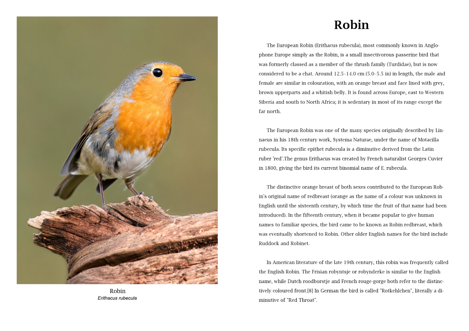
I am making a double page A3 option so that each page is A4 size.

Version 1

 
Version 1 - Main text 14pt Times New Roman Regular - Main Heading 30pt Arial Bold
 
 
The construction for version 1 within Photoshop is shown in the following screen grab. Further versions have similar layers and tools with the only variation being font size and paragraph indents.


The use of Layers allows easy modification and the guides provide a framework for the layout. In this version the typography is simple with minimal fonts. The paragraph control is with no first line indents and the whole page is clean and suitable for the ornithological study. It is normal practice to show Latin names in italics. The A4 page size requires the main body of the text to be 14pt for reading at a distance, more so than a paperback which would tend to be held closer.

Version 2


Version 2 - Main text 12pt Arial Regular - Main Heading 30pt Arial Bold

Version 2 has the main text font changed to Arial and is 12 pt. A clean contemporary layout with reduced column widths adds an element of balance. The font change has produced a less academic look although being smaller may be a disadvantage.

Version 3


Version 3 - Main text 12pt Arial Bold - Main Heading 30pt Arial Bold

Version 3 uses a single wide column for the main text. This is easier to read than the two column versions above and is now with Arial Bold. The paragraphs have indented first lines which create a feeling of older style layouts while using a modern font. The photograph title is now moved to the left as this creates abetter balance and the main heading is moved to the centre.

Version 4

 
Version 4 - Main text 12pt Lucida Bright Regular - Main Heading 30pt Lucida Bright Demibold
 
Version 4 returns me to a serif typeface with Lucida Bright for all of the text except the Latin picture title which remains Arial. Picture titles are now moved to the centre to balance with the central position of the main title on the facing page. The main text I have kept regular as this adds a lightness to the page that is lost when the bold is introduced.
 
Conclusion 
 
The four versions are a mock up page for a book on British birds. It is unlikely that in such a publication there would be any outrageous fonts or layouts so the changes between the four are rather subtle. The variations therefore are as much in the layout and minor adjustments such as one or two columns, position of titles and paragraph indents. The major changes are the main text font and the choice of whether to use a serif typeface such as Times New Roman / Lucida Bright or a sans serif such as Arial. Arial is very similar to Helvetica (which isn't included in Photoshop) which is the most used font in almost every country of the world. In this instance, the subject matter and the scientific nature of the writing suits a serif and between the two I have used I prefer Lucida Bright. It is lighter and less aggressive  that the Times New Roman used in version one. The text should not compete visually with the photograph and in four there is harmony.


Exercise - Photographic book covers - choosing imagery

Photography as a book cover can be of any genre. For this exercise we are asked to find some examples in the following categories.

  • Out of Focus
  • Inverted
  • Historical archival but not depicting the subject
  • Still life close up
  • Minimalist landscape or scene for large sky

Within each type I will discuss the suitability of the cover after some research into the contents of the book and offer a conclusion why the publishers chose the image.

Out of Focus


"Disguise" is a tale of illegal wartime adoption and the subsequent life story of a man (Gregor) who spends his life with a suspicion that he may not be who he thinks he is. His adoptive parents and his real mother engage in lies and deceit to conceal the reality of who he is. The strain eventually takes it toll and Gregor leaves his wife and family to become a musician and tours Canada and Ireland, "an entire lifetime of departures and comebacks". Described as " a story of double misfortune turned into multiple good luck". 
The publishers will have wanted to convey the uncertainty of the central character and the lack of authenticity in the life of Gregor. The blurred image over written with the title word "DISGUISE" is sufficiently connected to offer a hint of a character who is not known and deliberately hidden.

Inverted


"NoVA" is set in North Vaginia, an otherwise normal part of the suburbs of Washington DC. It as view of contemporary America that starts with a 17 yo boy hanging himself and the subsequent ramifications that surround his family and friends. A tale of sex and drugs amongst the middle classes who work for the technology companies, federal contractors and government institutions of this area. Sharp social observation and dark humour are amongst the techniques used by Boice in this disturbing tale. The cover is not an obvious choice and the inverted picture can only be a metaphor for the upside down world inhabited by the characters. The white painted fence being typical in a clichéd sense for the middle class gardens surrounds of the eastern USA.

Historical


"Dominion" is complete fiction with a story that we have all pondered on at some stage. What If we hadn't won the second world war and the Nazis had control of Great Britain. Sansom creates a totally believable place where Jews live in fear, the radio and television are under state control and an underground Resistance movement is led by an ageing Winston Churchill. A Resistance spy is caught up in a plot to free a civil servant who has a secret that could change the world.
The publishers have chosen a cover photograph that is correct for the post war period. The foggy scene is perhaps London (although that's not crucial) and has a touch of menace with isolated characters exchanging a glance while a black cab is close by. 

Still life

De Botton takes the reader through 10 self contained studies of the sorrows and pleasures of the complex "workplace". These range from a biscuit factory in Belgium to the soulless headquarters of a firm of London accountants. It is a work of psychology and ideology rather than a practical guide to survival in the workplace. The book teems with interesting detail and shrewd commentary but there is no linear argument. A book rather more for discussion than a "how to". The cover chosen for the edition above shows an office chair in it component parts. We don't know whether it is new and waiting to be assembled or whether it has been taken apart. It shows us the parts rather than the sum of the parts and that is how the book is arranged. As I mentioned, there is no linear argument, only a series of disconnected studies. The photograph connects on a materialistic level, in as much as we are all familiar with a chair in the office an we recognize it here.

Minimalist landscape


A story emanating from the attacks on the Twin Towers of The World Trade Centre in New York on September 11 2001. Keith the central character is caught up in the periphery of the event and finds himself making his way to his one time family home where he is reunited with his estranged wife. He recounts to her seeing people falling from the windows of the twin towers and then later they watch a performance artist recreate the scene as a stunt. Keith feels his life is falling away and through various minor story variations the theme develops to incorporate all three.

Apart from the text on this cover there is nothing other than clouds and two vertical parallel lines. It is clear why the photograph has been selected. The "Falling" theme is present physically and metaphorically throughout the book and the shot from above the clouds invokes a feeling of vertigo, height and danger. The two parallel lines act as a metaphor for the falling action, or at least a trace of it where it has been.


Conclusion

I am concious that there are two ways of approaching this subject at the conceptualisation stage of the process. The straight forward concept will use an image that is overtly connected with the content of the book. The other option is to use an image that is symbolic or at some secondary level has an allegorical link to the content. The use of metaphor is perhaps the most often used to entice the reader to take a closer look inside. There is a point at which the imagery will become too obscure and that can only be counter productive. The typology has to fit around the image and as such is in a auxiliary role. A cover design using graphic art techniques would start with the text and manipulate a design to suit. 

Friday, 28 March 2014

Off on a Tangent

I am finding it difficult to concentrate on the exercises at the moment. I know the reasons but only time will change my attitude towards them, so in the meantime I am happy to sit and take a few Springtime bird shots. On issues of layout and placing the images on a page I am still trying to determine the need for a white border for colour photographs. Maybe these two will help me see the issues and gain an outcome.


Goldfinch - D800 with 500 f4 and 1.4TC

Greenfinch - D800 500 f4 with 1.4TC
 
Robin - D800 500 f4
 

Saturday, 15 March 2014

Using Type Tools - Applying a drop shadow to type

Following on from the previous exercise and using the same file the task now is to add a drop shadow to the title text. This was not a technique that I had come across before.

The workflow is.


  1. Duplicate the "Title" layer
  2. Click on the lower of the two
  3. Layers > Gaussian Blur and set radius to 10 pixels
  4. Use Move tool
  5. Move down and to the right
  6. Layers window, set opacity to 50%


Screen grab with drop shadow.

The technique is a gimmick and not one that I will be using too often. There are numerous variations within the capabilities of Photoshop to produce work suitable for any number of situations.


Screen grab for coloured drop shadow


More to be added.


Using Type Tools - Getting Started

This section of the course will demonstrate the text tools in Photoshop in readiness for the book cover assignment.The title Getting Started is a course annotation and not mine. In my work I have been using the text features within Photoshop for 10 years. It will be by way of a refresher then to do the exercises and by further probing I am sure I will find something new.


As a start, a simple piece of text and a title, using Verdan 48 pt for the title and Ariel Regular 12 pt for the main text. The text is left aligned with the grid and a vertical guide used in the page centre line.