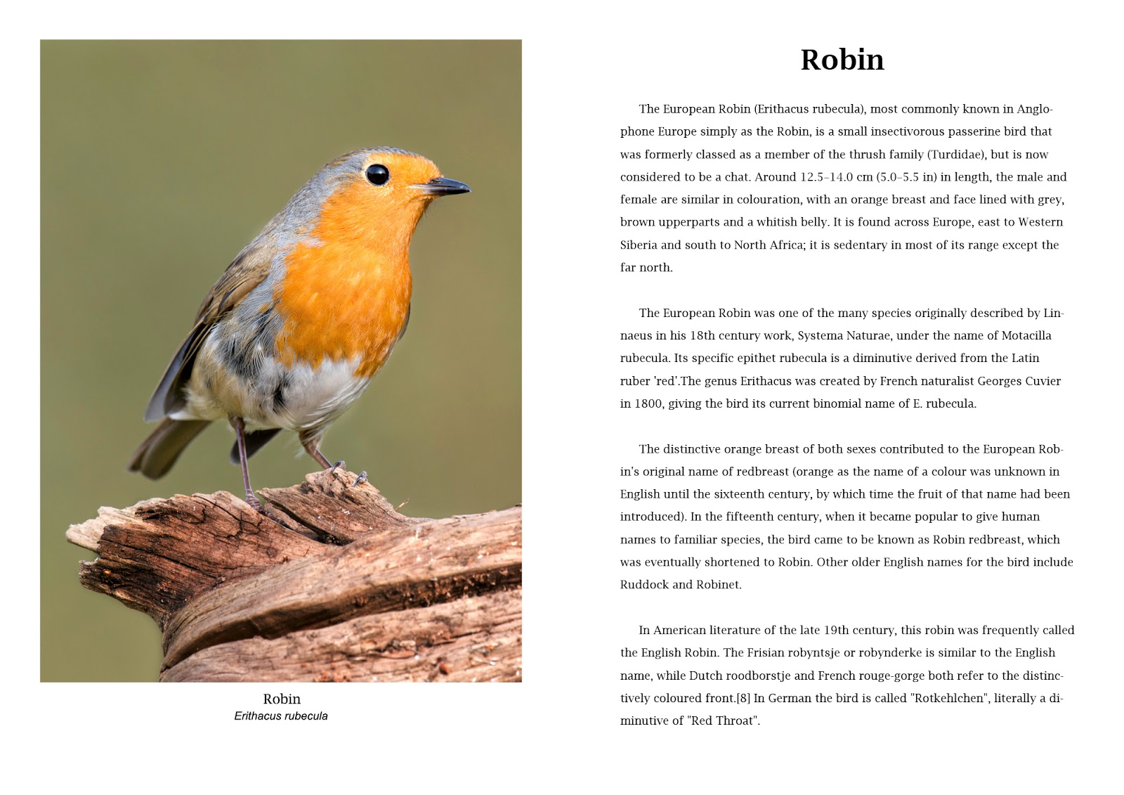
I am making a double page A3 option so that each page is A4 size.
Version 1
Version 1 - Main text 14pt Times New Roman Regular - Main Heading 30pt Arial Bold
The construction for version 1 within Photoshop is shown in the following screen grab. Further versions have similar layers and tools with the only variation being font size and paragraph indents.
The use of Layers allows easy modification and the guides provide a framework for the layout. In this version the typography is simple with minimal fonts. The paragraph control is with no first line indents and the whole page is clean and suitable for the ornithological study. It is normal practice to show Latin names in italics. The A4 page size requires the main body of the text to be 14pt for reading at a distance, more so than a paperback which would tend to be held closer.
Version 2
Version 2 - Main text 12pt Arial Regular - Main Heading 30pt Arial Bold
Version 2 has the main text font changed to Arial and is 12 pt. A clean contemporary layout with reduced column widths adds an element of balance. The font change has produced a less academic look although being smaller may be a disadvantage.
Version 3
Version 3 - Main text 12pt Arial Bold - Main Heading 30pt Arial Bold
Version 3 uses a single wide column for the main text. This is easier to read than the two column versions above and is now with Arial Bold. The paragraphs have indented first lines which create a feeling of older style layouts while using a modern font. The photograph title is now moved to the left as this creates abetter balance and the main heading is moved to the centre.
Version 4
Version 4 - Main text 12pt Lucida Bright Regular - Main Heading 30pt Lucida Bright Demibold
Version 4 returns me to a serif typeface with Lucida Bright for all of the text except the Latin picture title which remains Arial. Picture titles are now moved to the centre to balance with the central position of the main title on the facing page. The main text I have kept regular as this adds a lightness to the page that is lost when the bold is introduced.
Conclusion
The four versions are a mock up page for a book on British birds. It is unlikely that in such a publication there would be any outrageous fonts or layouts so the changes between the four are rather subtle. The variations therefore are as much in the layout and minor adjustments such as one or two columns, position of titles and paragraph indents. The major changes are the main text font and the choice of whether to use a serif typeface such as Times New Roman / Lucida Bright or a sans serif such as Arial. Arial is very similar to Helvetica (which isn't included in Photoshop) which is the most used font in almost every country of the world. In this instance, the subject matter and the scientific nature of the writing suits a serif and between the two I have used I prefer Lucida Bright. It is lighter and less aggressive that the Times New Roman used in version one. The text should not compete visually with the photograph and in four there is harmony.


No comments:
Post a Comment