Robert Frank is quoted as saying
“Black and white are the colors of
photography. To me they symbolize the alternatives of hope and despair
to which mankind is forever subjected.”
We can see from the above list of photographers that influence me that none of them would have had that much opportunity to have used colour although there are a few exceptions, notably Weston who did some work late in his life with Kodak colour film.
As human beings (unless colour blind) we see the world around us in colour and to translate that into a black and white image with a full range of tones and contrast is not easy. There have been monocle type viewing devices with special filters that were an aid but I have never used one. I have though spent 30 years with black and white film and with digital photography needed a way forward where I could control the output with a greater degree of security of outcome. There has since the nineteen sixties been a tendency for high contrast punchy images, spawned by the likes of Bailey in the world of fashion and later the war photography of Don McCullen and may others all using modern multi coated lenses designed to produce contrast and extreme sharpness.
This style of black and white is legendary and many iconic images from the last 50 years are seminal works and part of the history of photography.
Prior to that period lenses were producing less contrast and for those like Cartier Bresson and Frank who were using uncoated Leica glass the resulting negative had a softer feel. The images were sharp but the contrast was less than a multi coated modern lens.
To understand which lenses are likely to give low or high contrast we need to understand Modular Transfer Function (MTF). MTF graphs can be confusing. A test image is taken using a target with varying line shapes.From inspection the image is plotted on a graph. On the vertical axis we see the change in contrast as a percentage from 0 to 100. Zero means no contrast at all (black is grey and white is grey) and 100% means full contrast (the black is still black and the white is white). All values in between indicate that a percentage of white light is spilling over into the black part of the test pattern. 50% contrast means there is a difference between the dark grey and light grey areas of 50%. On the horizontal axis we read the image height of the image area, the radius of which can be calculated from the diagonal of the picture frame. A 35mm negative has a diagonal of 43.2mm and the radius of the image circle is 21.6mm. Important points are the 3mm radius as this gives the center performance or the on-axis performance. The 12mm radius covers the image on the short side of the negative (2 times 12mm equals the 24mm vertical size). The 18mm radius covers the long side of the negative, whilst 21.6mm covers the extreme corners.
Within the horizontal and vertical axes we see four groups of curves which meander from centre to corner (0 to 21.6mm) On the top we have the contrast transfer for 5lp/mm (image resolution is the detail an image holds and is measure in lines per millimetre), which defines the overall contrast and the subject outline. Working down the four lines, next is10lp/mm, 20lp/mm and finally 40lp/mm which defines the maximum resolution and smallest points that the lens can record with some clarity. The solid line curves are paired with a dotted line. These represent the two different orientations of the line patterns. In practice the better results come from curves that stay as close together as possible. If the curves diverge widely we will see astigmatism and coma and in general a softness of the smaller image points.

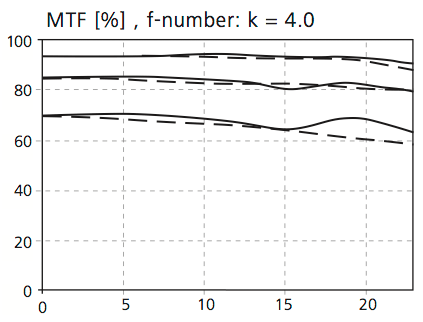
MTF for Leica 35mm f/1.4 Summilux-R @ f/2.8
The graph above for the 35mm Summilux R lens at f2.8 shows good performance at the centre but poor at the edge of the frame, with considerable astigmatism as shown by the divergence of solid and dotted curves.
MTF Zeiss 100m f/2 Makro-Planar MTF at f/4
The graph above for the Zeiss 100mm f/2 Makro at f4 shows remarkable definition across the whole of the frame with very little astigmatism.
The low contrast negative can however be used to good effect in the darkroom. An increase in contrast is possible when printing to produce an image that has increased depth by enhancing foreground contrast and allowing the distance to remain in low contrast resulting in aerial perspective.
An example is seem in these photograph:

Stieglitz, A. The Hand of Man,1902, Copyright Museum of Modern Art, New York

Frank, R. London Street,1951, Copyright Victoria and Albert Museum, London
With digital practice there are a number of techniques to simulate the look and feel of a image with variable contrast. The important point to remember is that adding contrast is much easier that removing it, so to that end I always shoot raw files and ensure during the post processing that the curve is linear until I choose to add contrast with an S curve. Film stock has a curve and a recipe for how it reacts to the various coloured wavelengths of light. Adding these curves on layers and masking allows the creation of an image with varying areas of contrast.
In the image below the distant bushes in the top right have been left as low contrast, while the Marram grass and the wood of the beach hut have increased contrast. Also the area under the hut has low contrast to retain detail. The variable contrast areas add depth to the image and allow the less interesting areas to have the same validity as those in the foreground.

In the image below the distant bushes in the top right have been left as low contrast, while the Marram grass and the wood of the beach hut have increased contrast. Also the area under the hut has low contrast to retain detail. The variable contrast areas add depth to the image and allow the less interesting areas to have the same validity as those in the foreground.
Beach Hut Leica MM 35mm Summicron.
In the image below the grasses have high contrast in the centre with less towards the edges. The distant areas have no contrast adjustment and retain the original linear curve. The sand areas have contrast enhancement through the centre with less at the edges. The technique contributes to the apparent 3D in the image.

No comments:
Post a Comment