At the heart of every photograph is a message, something is being transmitted to the viewer by way of a visual statement. The variety is endless and will range from the sublime to the ridiculous and at some point a selection will have been be made, whether by the photographer or by an editor / curator to include an image and not others. The selection process will vary and at some point the question will be asked "Has the Brief been met", Did it succeed" "Iwill use this one, not that one because ..." etc ?. The course notes offer some help in reviewing this by way of an initial 10 point check list to bring some structure to how we should think analytically about our own work and then at a later stage the work of others. Prior to working on the next exercise I will run through the list and add some comments.
First Impression
With photography being ubiquitous it is important that the first viewing of an image is striking and captures the viewer. This is the most important of the 10. How difficult this is will depend on where the image is being shown, and to who. In a Gallery with 100 images the competition is less (having overcome the initial barrier of being selected for a gallery) than perhaps a Flickr group showing wildlife images where there are many thousands. Bold colours, striking graphic monochrome with deep blacks may have the edge on a delicately toned image with a reduced gamut or the subtle mid tone greys of a high key monochrome portrait. Similarly how the image attracts the viewer by its content is important. Robert Capa (1913-1954) is quoted as saying "If your pictures aren't good enough, you're not close enough" and that may well be true as a measure of capturing attention. The casual viewer will have a different need from an image than a fine art magazine editor or museum curator. The later will be interested in how the image will meet an academically inspired audience and will be looking for substance over style. The casual viewer will be captured by a first impression as their reference for remembering the work and the photographer.
The Genre
Genre should be obvious. Landscape, architecture, portraits, still life etc. Lines and boundaries are often crossed and sub genres such as environmental portrait have developed. Historic genre in the guise of pictorialism and straight photography were prevalent during the 1920's but the terms are rarely used today in contemporary work.
Intended Use
This should be an easy concept to understand and in some instances such as advertising there can be no doubt. Fine Art work for gallery sales can of course cross the divide and Stock images at an agency can find uses across a wide spectrum.
The Situation Facing the Photographer
Photographers make decisions and being in the right place at the right time is paramount, especially when working in News and Sports coverage. It is essential to anticipate the situation facing you on the street or at sporting event and be thinking ahead.
Planned v Unplanned
Planning is essential (If you fail to plan then you plan to fail) and the degree to which this is carried out will be evident in the final work. In News and Sport it is essential to have researched the topography of where you will be working. Being able to navigate around the subject, gain good lighting etc is all a product of a plan. Planning for a Studio or Location shoot requires a check list and once again it is essential. Knowing you subject and anticipating what is likely to happen enables the photographer to be one step ahead and in position for what may only be a fleeting moment when the right shot can be made.
Note: I have worked as a Planner in the Construction Industry for 30 years, so tend to be quite positive about the subject.
Technical
There are a number of Technical issues that can enhance or degrade the image. The actual craft practice of ensuring correct focus, no dust on the sensor or marks on the film, sharpening etc have to be correct and if not achieved should result in rejecting the image. Choices of technical matters such as format, lens selection, shutter speed etc are needed to be correct to suit the image and its genre. Incompetence should be easy to see, although with some genre the photographer will be deliberately avoiding a "normal" outcome in order to enhance the image. This can be difficult to spot and careful attention should be given to any statement of title where the artist is deliberately using poor technique as a metaphor for an underlying narrative.
Style
Experienced photographers, especially when working in a single genre will develop a style, to the point where the viewer can identify them without attached text. A consideration of Style is subjective and is unlikely to be seen in a single image, but more so from a body of work. The work of Michael Kenna (1953 - )for instance has a distinctive style.
Intent
Without a Statement of Intent it is difficult to judge an image on this alone. Critics and commentators spend a lot of time writing about work referring to an assumed intent, especially of the works of the Masters. The intent is closely linked to use.
Sufficient Information
Information on the image may be available, although more likely not. Images with any journalistic intent should always be captioned and the basic, Who, What, Why, When,Where and How will enhance the user experience and justify the image. The course text suggests that images that have been Photoshopped are worth less creatively, a comment that I don't understand. Photoshop is a creative tool associated with digital imaging and is a replacement for darkroom techniques, all of which are valid if used with care.
Success
Within a frame of reference, the points above being taken into consideration and it being accepted for use an image will be a judged a success. An image being chosen for exhibition may have to undergo an extended selection regime, whereas an image for illustration on a website for one day may not be so exhaustive. The brief is the starting point for measuring success and the ability of those making the selection to be objective is an important combination
Thursday, 9 January 2014

Saturday, 14 December 2013
Exercise Page 18 - Writing a caption.
The main function of the caption is to enhance the photograph, adding detail such as names, locations and other pertinent information. Captions are also used to tie the photography to the wider text in the book and to reinforce major points brought out elsewhere.
There are five questions that need to be answered, although not on every occasion and depend on the type of publication.
Who ?
What ?
Why ?
When ?
Where ?
How ?
If the photograph accompanies a news story it is essential to write the caption for readers who will not read the main text, in which case as much of the WWWWWH should be covered. The words should not be wasted and phrases such as "is pictured" or "is shown" avoided as the photograph already
serves that purpose.

The version above is suitable for an outdoor magazine and is aimed at walkers and ramblers. It fixes where the photograph was taken, and takes account of an international readership then details the specific location. The reader may be familiar with the location, in which case they will recall their own experiences and there will be those who are making plans to visit the area, in which case the caption and image acts as a marketing tool.

The version above makes no reference to its location and the caption deals specifically with image composition, the colour of the light and the diagonal line of the wall. It is likely that the image would be to illustrate are sizable amount of instructional text associated with an article on landscape photography and the various composition tools that can be employed.
References:
Photojournalism - Photography with a Purpose, Robert L Kerns, Prentice Hall International.
Monday, 2 December 2013
Assignment 0ne - Notes on Feedback
The feedback for this was mixed (very few issues technically but concern over my engagement) and there is one phrase that took my attention. "From the images you submitted I do get a sense of your neighbourhood but in quite a detached / almost brochure like way." Although there is a hint of criticism and disapproval I am not surprised by my tutors reaction. I had taken an approach that would illustrate the area but had not explained my intentions in sufficient detail. I had concentrated on a small part of the town rather than the cliched modern townscape and the struggle to encapsulate nine square miles into 12 images. The results would have been similar to any market town in the UK, showing the result of a five year recession and the increase in urban decay. Illustrating the recession and urban decay would of course be open to interpretation and a number of metaphors are available to portray this.The intention was to show a small area in a style that reconstructed the images of Eugene Atget and his work in the old parts of Paris around 1897 - 1927. Atget's work is nowadays considered with the highest regard but at the time he was not offering his work as Art. It was commissioned by the authorities for record images prior to demolition and development and perhaps considered documentary. His retail business was selling photographs to artists visiting Paris so that they could on their return home paint the scene he had taken. The sign above the door of his shop did not describe himself as a photographer, instead it read "Documents pour Artistes" and being curious about this Man Ray visited him one day and purchased prints and started a small collection of work that today is kept in George Eastman House, Rochester, NY.
While considering the implications of the feedback I had time to shoot a few images much closer to home. The village has Common Land where "Commoners" have rights to graze cattle. The common is a mysterious place on the west side of the village and at the edge of the Fenland. It is a wet area that attracts mists and apart from the simplest of maintenance is generally unkempt.


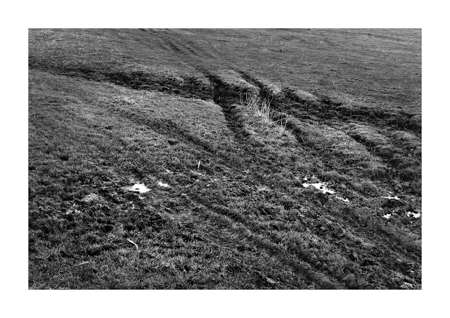
While considering the implications of the feedback I had time to shoot a few images much closer to home. The village has Common Land where "Commoners" have rights to graze cattle. The common is a mysterious place on the west side of the village and at the edge of the Fenland. It is a wet area that attracts mists and apart from the simplest of maintenance is generally unkempt.

Wild Wood

Depression

Abandoned

No Road #1

No Road #2
Conclusion
This assignment has not been easy. Following the completion of P2: Landscape I had a year away from The OCA and the result is that I have lost the rhythm and practice of academic photographic study. I have not been able to gauge the pace and the result is trying to work too quickly and get an assignment in, probably ahead of time. I am also finding myself acting too commercially in my thinking. My own business deals with time as a commodity, coupled to resources and a cost.
My greatest hurdle is to think less literally and be less cautious. I need to experiment more with conceptual ideas and make images that are less predicable.
Wednesday, 27 November 2013
Reading List
Quite a few new books and some old favorites that have well thumbed pages.
Photojournalism - Photography with a Purpose - Robert L Kerns - Prentice Hall, England c 1980
Context and Narrative - Maria Short - AVA Publishing
Behind the Image - A Fox and N Caruana - AVA Publishing
The Photography Reader - Liz Wells - Routledge
After Photography - Fred Ritchin - WW Norton and Co
Understanding a Photograph - John Berger - Penguin Books
Ways of Seeing - John Berger - Penguin Books
Photography at the Dock - Abigail Solomon-Godeau - University of Minnisota Press
Paris - Eugene Atget - Taschen
The freelance photographers market handbook 27th edition - BFP Books
Digital Stock Photography, How to shoot and sell - Michal Heron - Allworth Press
Photography A Critical Introduction - Liz Wells - Routledge
Digital capture and Workflow - Tom Lee - Amhurst Media
Stieglitz, Steichen, Strand, - Malcolm Daniel - Yale University Press
Photojournalism - Photography with a Purpose - Robert L Kerns - Prentice Hall, England c 1980
Context and Narrative - Maria Short - AVA Publishing
Behind the Image - A Fox and N Caruana - AVA Publishing
The Photography Reader - Liz Wells - Routledge
After Photography - Fred Ritchin - WW Norton and Co
Understanding a Photograph - John Berger - Penguin Books
Ways of Seeing - John Berger - Penguin Books
Photography at the Dock - Abigail Solomon-Godeau - University of Minnisota Press
Paris - Eugene Atget - Taschen
The freelance photographers market handbook 27th edition - BFP Books
Digital Stock Photography, How to shoot and sell - Michal Heron - Allworth Press
Photography A Critical Introduction - Liz Wells - Routledge
Digital capture and Workflow - Tom Lee - Amhurst Media
Stieglitz, Steichen, Strand, - Malcolm Daniel - Yale University Press
Monday, 25 November 2013
In Two Minds (Both my own)
I find myself discussing with myself all aspects of photography. This may appear a little confusing and like playing oneself at chess. An impossible pursuit as one always knows the opponents next move and will result in stalemate on every occasion. These discussions are wide ranging and move from the self doubt of why am engaging with photography to issues relating to technique, style, lack of coherent thoughts and a suspicion that I am a Luddite masquerading with a digital camera when I aught to be basing my work entirely on that of the 19th century. Atget, Strand, Weston, Edwin Smith and others all have made images within a style and genre that attract me and I have the need to make similar work. I am may of course just be caught up in the nostalgia of those times. A simpler way of life where pointing the camera at oneself was called a self portrait and society didn't consider it necessary to invent a new word (Selfie) and were content. So I know the photographers I feel an empathy with but on the other hand I feel I should be having the same feelings for 21st century street photographers and some of the so called modern masters such as Martin Parr, who for instance I find most unremarkable. This irreverence to a member of Magnum is almost heresy but I find it very difficult to engage with his work and the man ( who I have only seen on television) and maybe that will change one day. My question then is should I bother to research work that I have no connection with or to pursue it with a vengeance and make myself enjoy it. Do we have to engage with all photography ?.
Another dichotomy to deal with at the moment is the need to understand how and where PWDP is helping me with professional practice. On the one hand I fully appreciate that there is a need to apply certain academic standards and this requires a body of work that has taken 600+ hours to complete. On the other hand my experience of preparing work for customers is that the amount of time available is much less and after a simple Scope Document (maybe just an email) the work has to be performed very quickly, and by implication to a budget. I add this comment only as a note and fully realise that I will have to spend more time in the future to elaborate on (and publish here) the Ideas and Concepts that I am taking with me when working. They exist and I hope the work I make demonstrates this but without writing it down I am aware of the shortcomings.
Another dichotomy to deal with at the moment is the need to understand how and where PWDP is helping me with professional practice. On the one hand I fully appreciate that there is a need to apply certain academic standards and this requires a body of work that has taken 600+ hours to complete. On the other hand my experience of preparing work for customers is that the amount of time available is much less and after a simple Scope Document (maybe just an email) the work has to be performed very quickly, and by implication to a budget. I add this comment only as a note and fully realise that I will have to spend more time in the future to elaborate on (and publish here) the Ideas and Concepts that I am taking with me when working. They exist and I hope the work I make demonstrates this but without writing it down I am aware of the shortcomings.
Wednesday, 13 November 2013
44th Eastern Open Exhibition - Radiation Tester
The 44th Eastern Open is the largest Open competition held in the town each year and sees an entry in excess of 700, with 70 or so being selected.

The Arts Centre (Formerly The Guildhall) has three large exhibition spaces and they are all used to show the work in what is a bright airy environment complete with pop up cafe.
I went along twice. The first time I was taken aback by the diversity of the selection. Oils, acrylics, photography etc and the contrasting styles, shapes and sizes. The variation was reflected in the prices ranging from £110 to £10,000. Not being an artist in the generally accepted sense I know little of how major items in oils or pen and ink are made but one thing was certain: this was all good quality.On this first visit I had not taken a notebook so didnt get any thoughts written down but I had noticed the work of photographer Mike Harding. As you can only enter three pieces he had done very well in getting three hung and had also won best in show and the £2000 prize.
The second visit was to take a closer look at "Radiation Tester", Mike Hardings winning photograph and another called "Mr and Mrs Williams". I have since been in contact with Mike and he has kindly allowed me to include a copy of Radiation Tester" below.
"Radiation Tester" is a 30" x 40" colour print with a simple cream matte mount and a natural wood coloured frame. The catalog doesn't say but I guess its a C type print. The image shows a simple T shaped pole with cross head in a large wilderness of unkempt grassland. Hanging from the two extremities of the cross head are two "fly catcher" like papers dangling in space.
The landscape format image is conventional in many ways. The horizon is one third up from the bottom and the T shape is almost in the centre. There is uniformity and the space around the T is perfectly sized to give the correct sense of space and scale. Even if the viewer had no knowledge of the title there is enough here to bring upon a sense of unease. There is a bleakness that is directed by the reduced gamut. The grass is a pale green, the other vegetation is dead, there is no soil only stone and the sky is an ominous grey. The use of shallow depth of field renders the distance out of focus but there is nothing to see, no buildings or fences and certainly no people or signs of where they have been. The light is flat with the overcast sky and once we read that the simple looking device is for testing radiation a coldness is felt of hidden danger.

Radiation Tester
Copyright - Mike Harding - Salhouse - Norfolk
Conclusion
At a mixed media exhibition it was encouraging that photography had made it to the top and that is encouraging. It is without doubt that my work is currently no right for showing to selectors at such a show. Again I come back to my lack of conceptual imaging and my constant involvement with technique over content. Further reading and research will hopefully overcome this trait and allow my work to have more narrative and be conceptually braver.
Wednesday, 6 November 2013
Part One - Exercise: Describe a photograph.
On page 16 we are asked to take one of our photographs and fully describe it in a few hundred words. The text should be complete with all factual information from beginning to final delivery. On the We are OCA blog recently I had positioned myself in a debate on monochrome as being less interested in colour so to balance my argument I will use a colour image.


Ashness Bridge - Cumbria
Prior to starting on the degree pathway my photography was overtly commercial and holidays were spent looking for images that would sell or at least stand a chance of being technically correct for stock images at Alamy, a picture stock agency whose only criteria for acceptance is technical excellence. I had been to The Lake District many times in the past and on this occasion we were revisiting some of the well trodden paths and enjoying being a tourist. The road to Watendlath is almost single track and has a small pack horse bridge crossing the stream that runs down to Derwent Water. It is without doubt one of the most photographed vistas and is synonymous with the town of Keswick, Mint Cake and the Northern Lakes. I had never stopped to shoot it before but on this visit I had a new camera so thought why not. The time of year is March, the light was transient with overcast cloud then shafts of bright sunlight. It was fantastic for what I needed and with the 85mm lens, vertical frame (most of my stock is shot portrait for page formating) I moved around with the tripod dodging the three or four others doing the same so I needed patience to exclude them from my shot. 85mm on a full frame DLSR at 100 ISO and the need for full DOF resulted in 1/60 sec at f16. Nikon white balance is very reliable on auto so I saw no need to change from that and I was shooting raw files so any issues of colour casts could be dealt with in post processing. Looking through the unprocessed files now I see there are some taken with the 35mm lens but I have always favoured telephoto lenses for landscape work and this looked better for the composition. I worked at the location for about 30 minutes not varying the viewpoint very much as I knew I wanted the classic Ashness Bridge image, Skiddaw in the background, a hint of Derwent Water and the town of Keswick. The landscape needed scale and when the walkers came along and stopped to look at their map the composition was complete. I knew that all I had done was repeat an image although the light, figures on road etc would be unique.Post Processing for this image was minimal. Capture sharpening applied using the Photokit plugin for Photoshop reduces the softness inherent with the anti alias filter just above the sensor. No cropping as the focal length and viewpoint filled the frame perfectly. The open areas of tone were checked for dust and removal with the clone tool. I cleaned up the image using Selective Colour, paying attention to the white and neutral channels. To make an image "pop" I use 20,60,4 of USM to enhace contrast. There is no output sharpening for Alamy as the client's final output will vary and the USM required for different printing techniques and final size is not known at this stage. An Alamy client bought the image for a whole page illustration in a book with 25,000 print run so the time spent had been worthwhile. It is not fine art but it is an acceptable illustration of a location in Cumbria.
Edit: My tutor has made the remark " When asked to describe a photograph I thought it was a shame that you chose a commercial / technical frame." I agree that it is a commercially driven image, taken with an A4 page in mind and having some dark space at the top where text could be layered. I will add another image in a later posting that is less commercial.
Edit: My tutor has made the remark " When asked to describe a photograph I thought it was a shame that you chose a commercial / technical frame." I agree that it is a commercially driven image, taken with an A4 page in mind and having some dark space at the top where text could be layered. I will add another image in a later posting that is less commercial.
Subscribe to:
Posts (Atom)